Changelog
A record of intentional improvements.
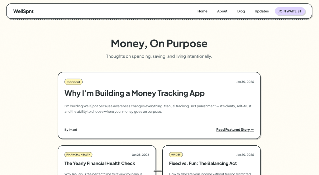
This update focused on shaping how WellSpnt is explained and experienced outside the app. A simple marketing site took form, designed to reflect the same calm, clarity, and intention as the product itself.
Behind the scenes
As the app became more defined, it became clear that the website needed to do more than list features. It needed to explain why WellSpnt exists and who it’s for.
This work focused on tone, pacing, and reassurance — making sure the site felt calm, honest, and aligned with the idea of awareness over pressure. Copy was refined, layouts were simplified, and the experience was shaped to feel more like a journal than a sales page.
This update laid the groundwork for future writing, updates, and launch communication.
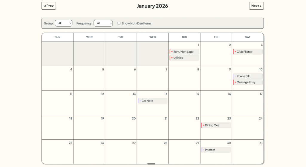
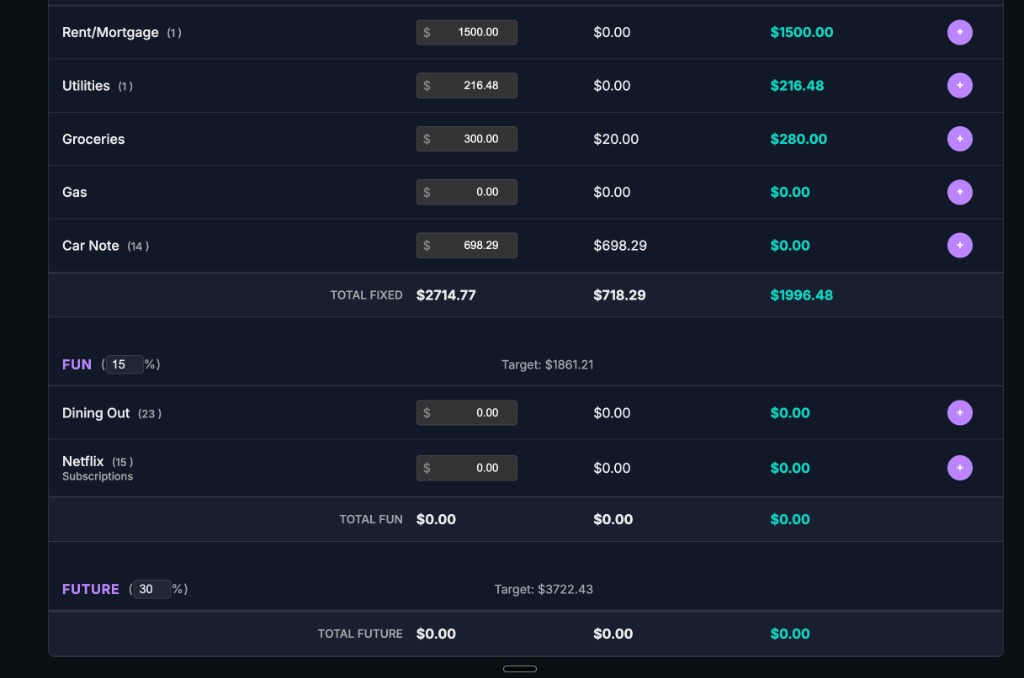
This update introduced a calendar view, making it easier to see how money moves across days and weeks. Spending stopped feeling like isolated numbers and started to feel connected to real life.
Behind the scenes
Before this update, money lived mostly in lists and totals. Adding a calendar made it possible to see when things happen, not just how much.
Seeing spending laid out over time helped reveal patterns that were easy to miss before — busy weeks, quiet stretches, and moments where habits repeat. This wasn’t about adding complexity, but about giving context.
Time is a big part of how we experience money, and this update helped bring the two closer together.
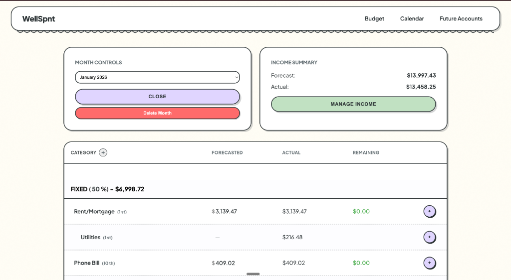
This update marked a shift in how WellSpnt looks and feels. The interface moved toward a calmer, more intentional visual language designed to make money feel less overwhelming and more approachable.
Behind the scenes
At this stage, the app worked — but it didn’t feel right yet. I explored new visual references and realized the design needed to feel softer, slower, and easier to sit with.
This redesign wasn’t about making things flashy. It was about creating space, reducing visual noise, and letting the numbers breathe so they’re easier to understand at a glance.
This shift set the tone for everything that followed.
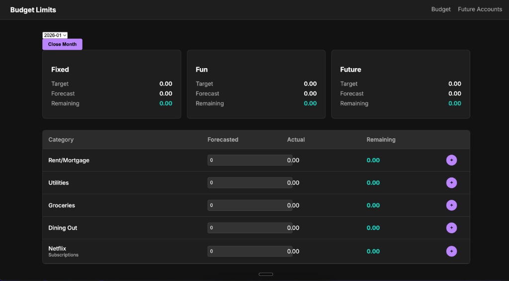
This update focused on making savings feel clear instead of confusing. WellSpnt now separates money saved this month from your total savings over time, so you always know what’s new and what’s already been set aside.
Behind the scenes
Savings used to blur together in a way that didn’t feel intuitive. This update clarified two different ideas: money you’re intentionally setting aside right now, and money you’ve already saved over time.
Once that distinction was clear, the rest of the app started to make more sense. This change was less about adding features and more about aligning the app with how people naturally think about future money.
This was the first real stretch of building WellSpnt. The focus was on getting the core of the app to exist in a way that felt usable, not perfect.
Behind the scenes
I built the basic structure for entering and grouping money, and shaped an early interface that could handle everyday tracking. It doesn’t replace spreadsheets yet, but this was the moment the app started to feel real.